 LinkedInLinkedIn
Flirtini is the dating app that offers a customized and enjoyable platform focused on fostering spirited conversations and playful interactions for singles seeking authentic connections and flirtatious experiences.
When I joined the project, both the brand’s visual identity - with its bold, electric colors, neon style, and logo - and an early MVP of the app were already in place.
Working within the existing brand style, my role involved translating product vision into thoughtful user experiences, designing new features from concept to launch, improving critical user journeys, creating prototypes, shaping interaction patterns, and crafting animations – continuously refining the app to make it look and feel more delightful, engaging, and easy to use.
Along the way, I helped grow the bottom line at Flirtini through purchase flow optimizations and monetization experiments, including cascade offers, discounts, and limited-time deals.
Below you can see a few examples of the work I did.
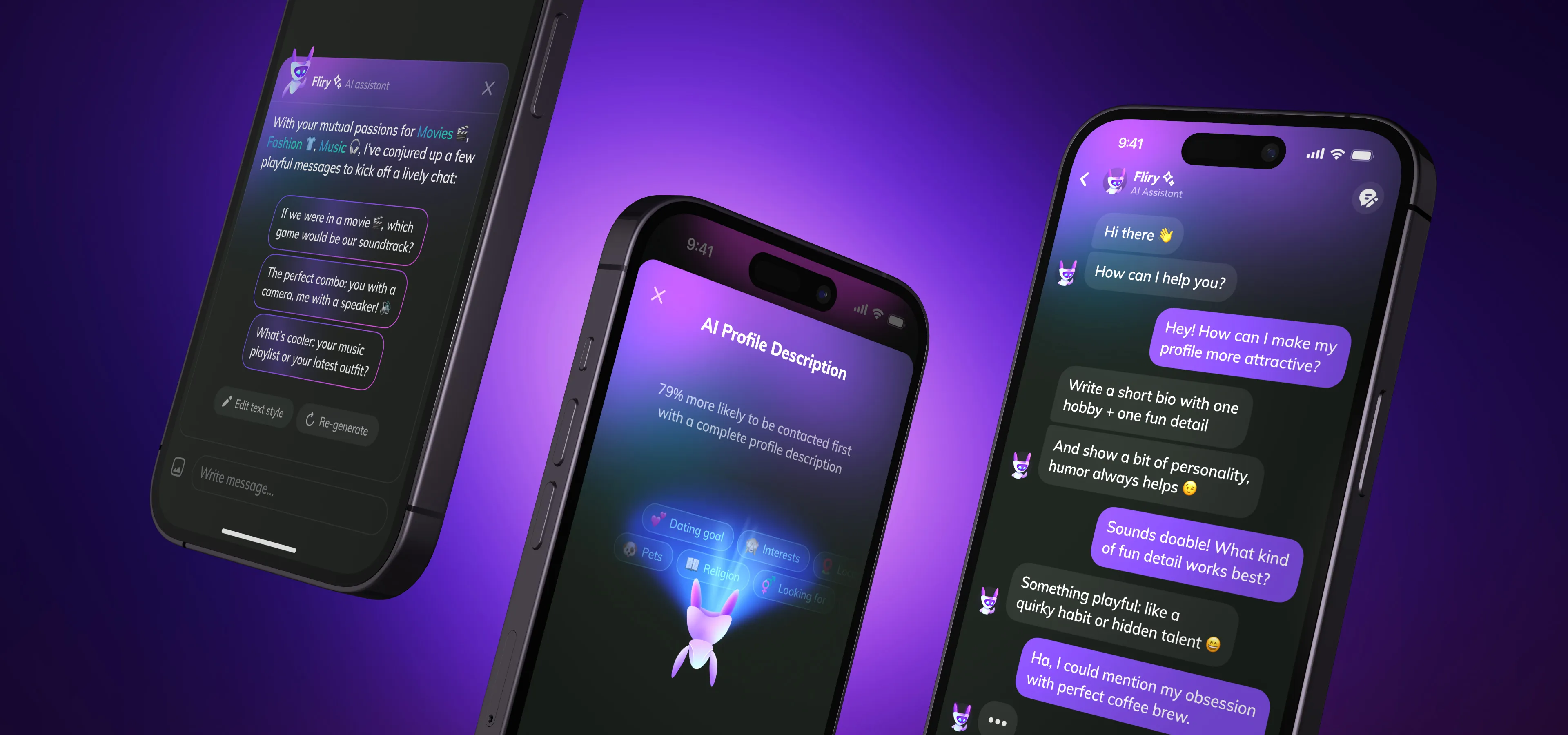
A survey we conducted among dating app users (not only ours) between the ages of 18 and 40 (US residents) to gather information about users preferences regarding AI assistant features revealed that most users prefer AI assistants to help them write profile description and icebreaker messages, as well as provide on-demand advice as a dating coach. Therefore, we began building these features.
We named our virtual AI dating assistant Fliry. Our talented marketing designer (who is also a wonderful illustrator) created a character for him, visualizing him as a friendly robot (54% of survey participants preferred a friendly robot design). And our other remarkable product designer brought him to life with animation.
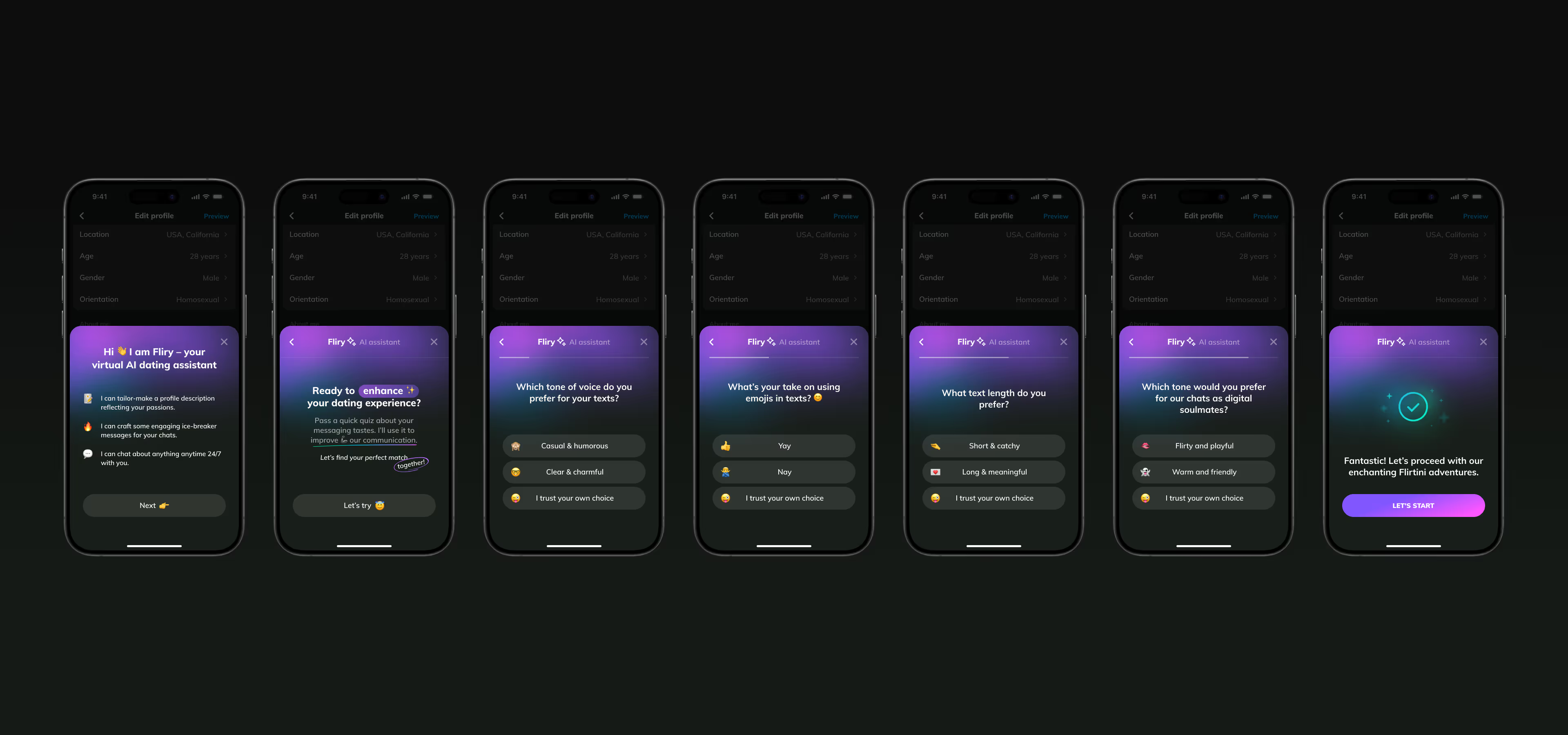
I designed an onboarding flow that allows users to personalize the AI assistant to match their communication style from the very first interaction.
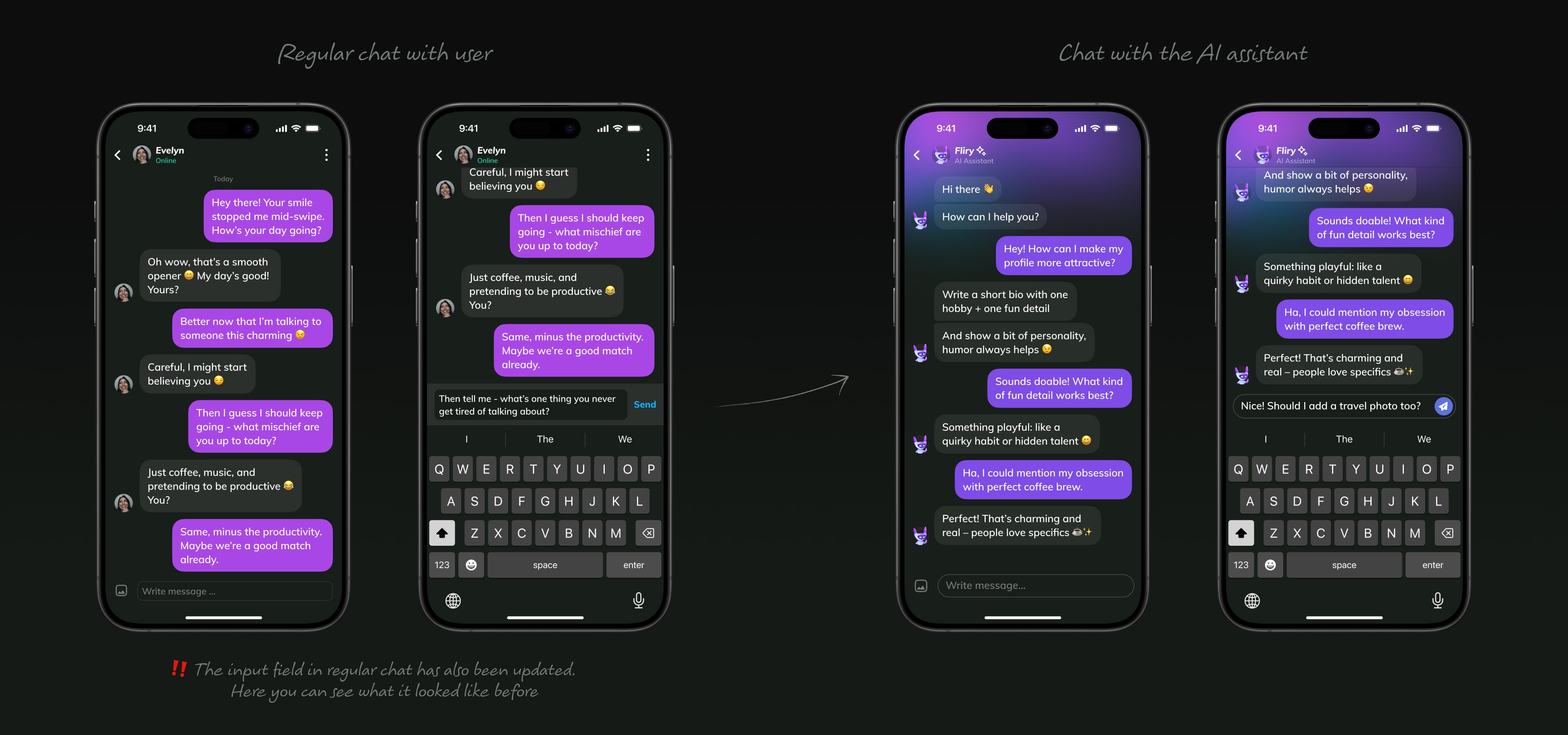
To make the chat with the AI assistant stand out from chats with other users, I slightly refreshed its appearance with a subtle gradient at the top of the screen and updated the color of message bubbles sent by user. Through our neon style, we aim to instill a sense of excitement in our users, inspiring them to embrace a new experience. Here, we were striving to achieve the same goal.
I also initiated an update to the chat input field, making it larger, more consistent and replacing the text-based Send button with an icon button to simplify localization support.
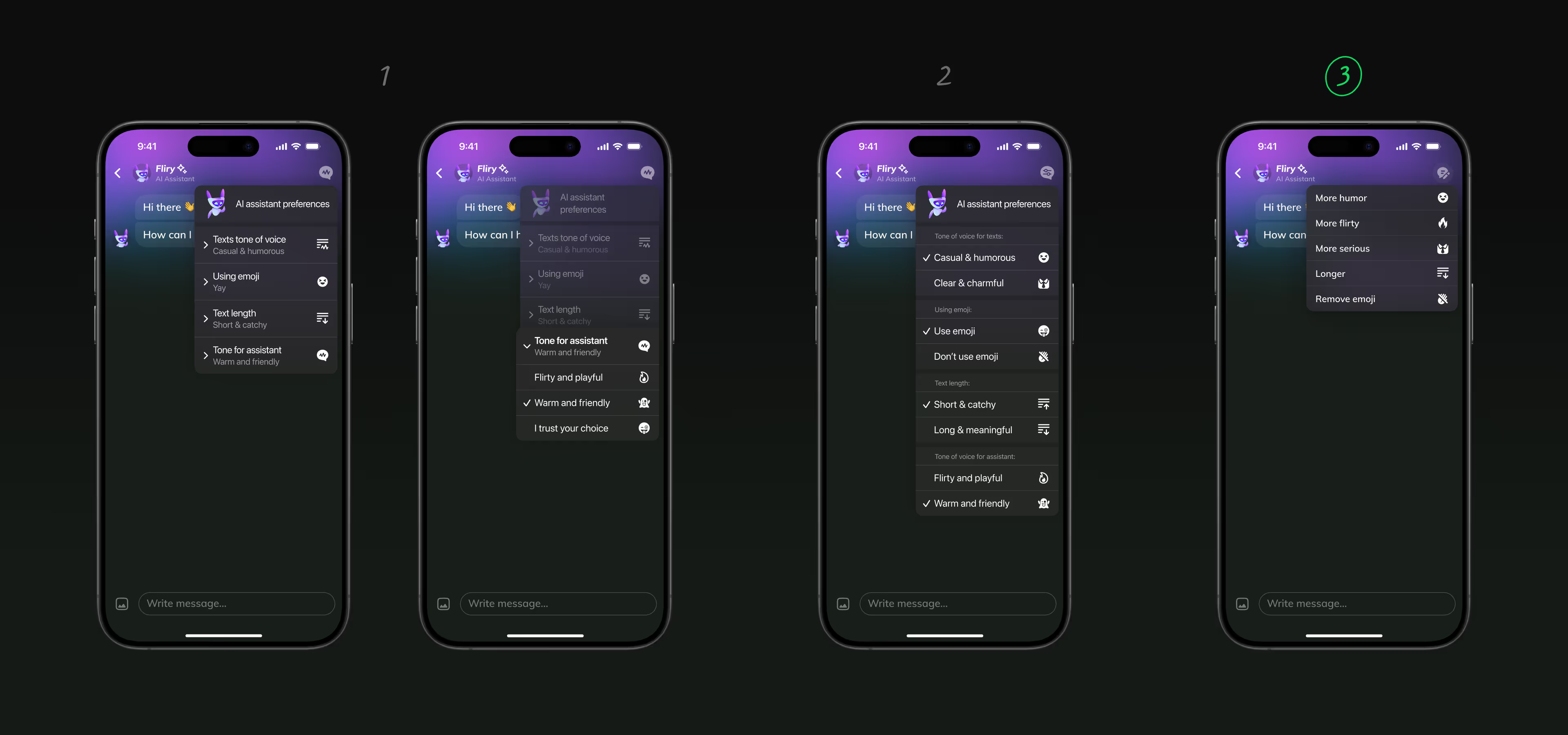
In addition, we added a way for users to customize the AI assistant’s communication style through the context menu. I explored several different options along the way and eventually we landed on the simplest one.
I then designed an icon animation that provides visual feedback confirming that the changes have been applied.
After release of AI assistant Fliry in June 2023, we saw that over 4,500 users took advantage of the tool in one day, with almost 18,000 messages being exchanged with the AI assistant.
50.4% of our app users surveyed after the release of the first version of AI-powered features said they consider Chat with Fliry to be the most helpful AI feature.
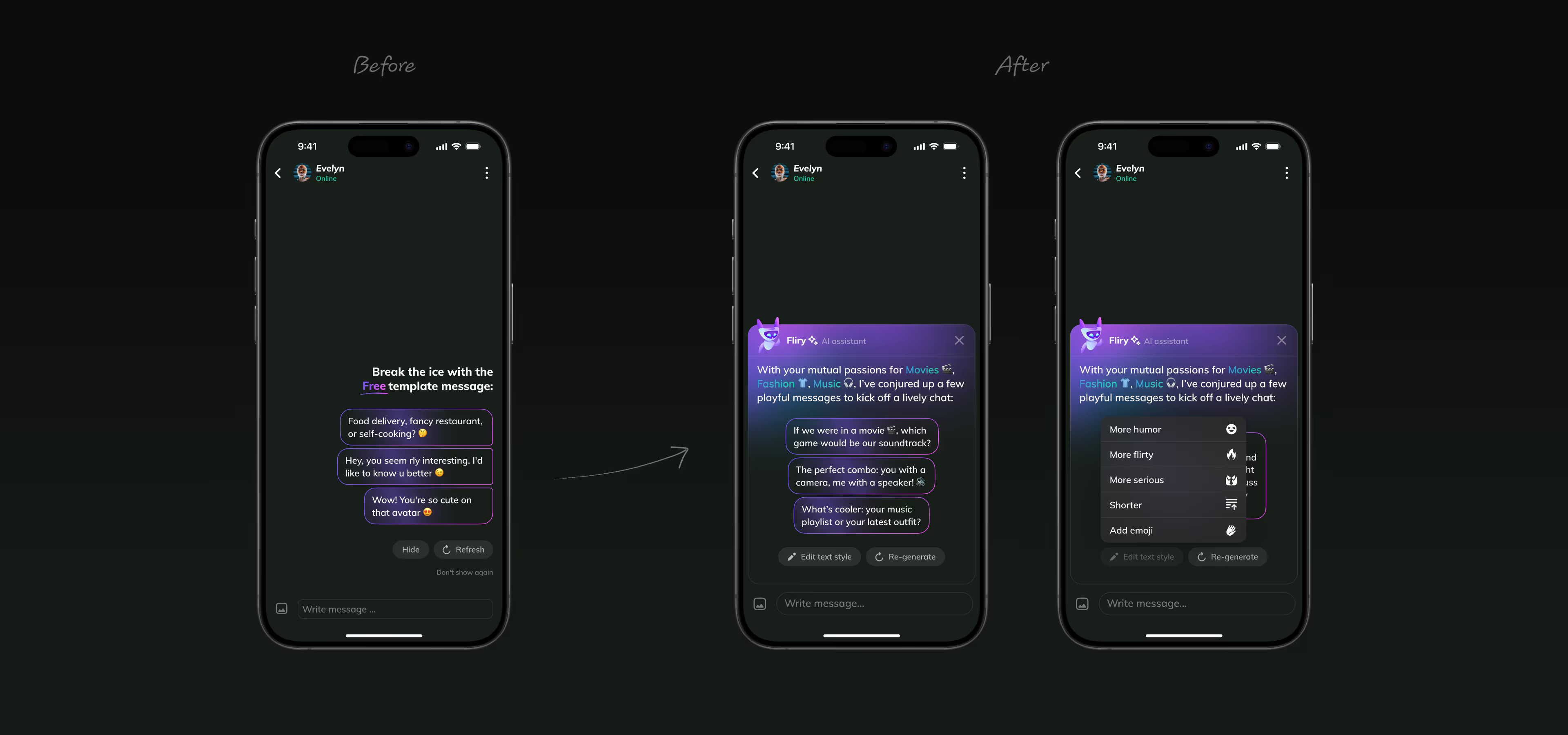
Before adding AI features, our app already offered icebreakers – short, pre-written openers that helped users start conversations faster. They worked and boosted the number of matches turning into chats.
However, they also came with a few clear limitations. The problem was that the list of icebreakers was fixed, so in theory, users could get the same opener from different people. And because those messages were quite general, they didn’t really feel personal or tailored to the person on the other side.
The release of ChatGPT opened up new opportunities to enhance this experience. Now, powered by AI, each icebreaker is generated specifically for the person you matched with – taking into account profile details, shared interests, and other mutual information between users.
I redesigned the icebreaker block to reflect these improvements and added the ability for users to fine-tune their icebreakers before sending – from tone of voice and length to emoji use and overall style.
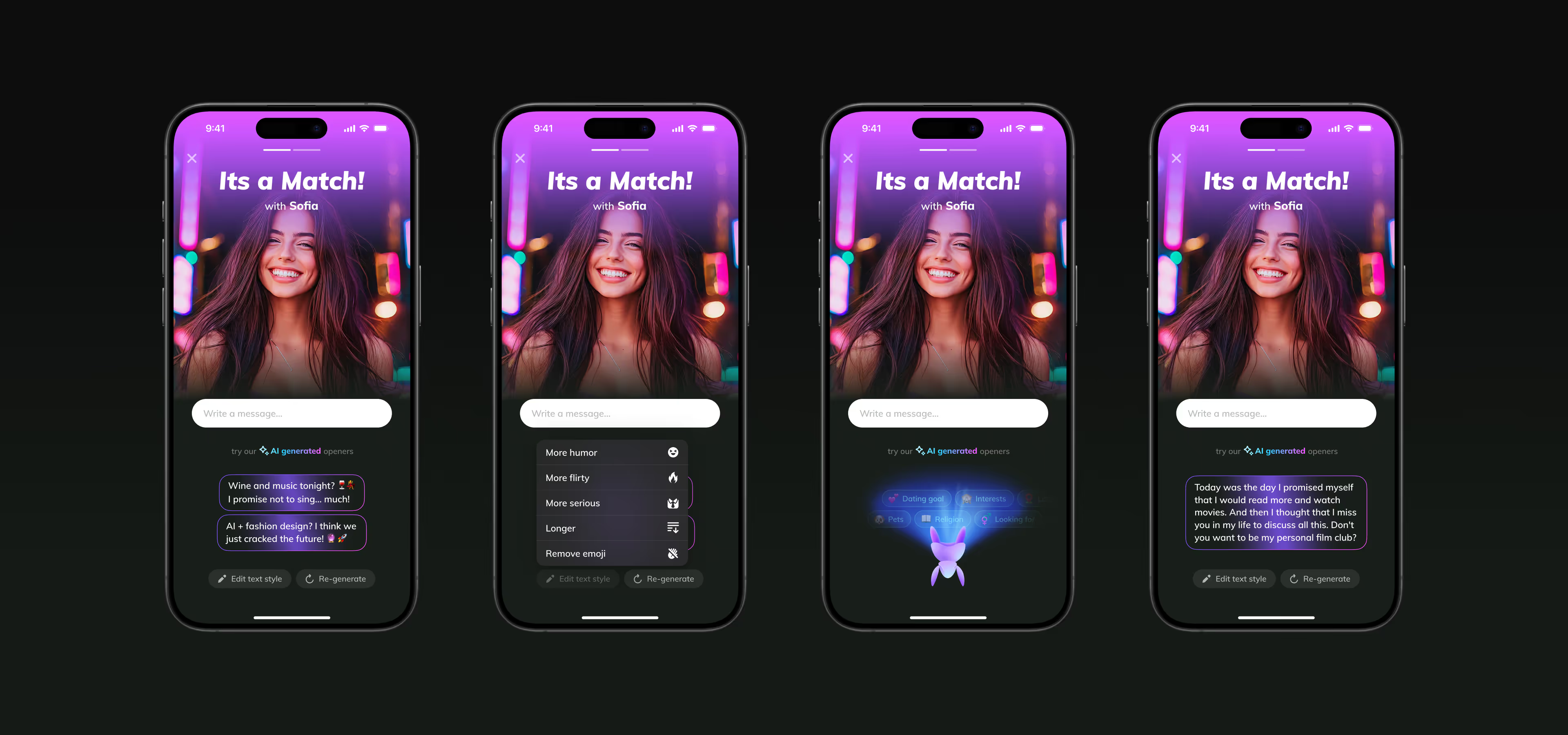
In the next update, I also redesigned the loader that appears while icebreakers are being generated. I used the character created for our AI assistant. The idea was to visually represent that each message is generated based on an analysis of user data - their profile attributes, interests, etc. Even though our character is a robot, I wanted to craft the animation to feel warm, genuinely friendly, and just more fun.
As a result, icebreakers now offer a more personalized experience and help start more fun, authentic conversations.
We also integrated AI-powered icebreakers into the match screen.
After releasing the first version of AI-powered Icebreakers based on ChatGPT 3.5, we conducted a survey of our app users. In response to the question, “How helpful do you find the AI Assistant in crafting engaging icebreakers?”, 25.8% chose the “Extremely helpful” option, and 17.2% chose “Somewhat helpful”.
Over time, with ongoing prompt refinement and new ChatGPT releases, this percentage continued to grow consistently.
Another AI-powered feature we introduced allows users to generate attention-grabbing profile descriptions and stand out from the crowd with unique details.
I fine-tuned an early version of the AI Profile Description feature that had already been designed by another team member. To create visual consistency across all AI-powered touchpoints in the app, I refreshed the AI Profile Description generation screen with the same gradient used in the AI assistant’s onboarding, chat with the AI assistant, and AI-powered icebreakers. I also replaced the old loader with a new one.

After releasing this feature, we saw good conversion among users who tried it (saving a generated description required a subscription). At the same time, its entry point was largely undiscoverable, hidden in the middle of the Edit Profile screen. As a result, a very limited number of users reached this feature in the app.
To make the feature more visible to users and increase its usage, I did the following:
I moved the banner that leads to this feature to the top of the Edit Profile screen so it’s immediately visible when users enter the screen, without needing to scroll. At the same time, I redesigned it.
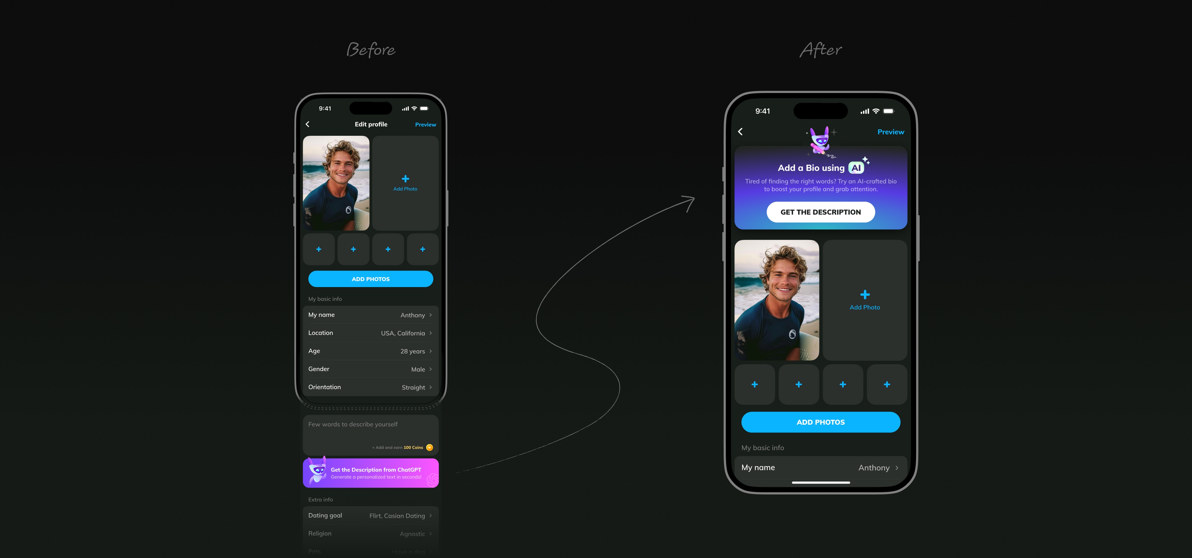
I also added an additional entry point to this feature one level higher, placing it at the top of the My Profile screen next to the user’s profile photo. This reduced the interaction needed to add a profile description to a single tap. I designed it as an attention-grabbing animated bubble to encourage users to start using the feature.
I also designed a flow that allows users to generate a profile description without needing to go to their profile, using a sheet that can appear on the Home screen as well as on other screens across the app.
In 2023 Flirtini was one of the first dating apps on the market to integrate AI features.
After the release of the first version of AI-powered features based on ChatGPT 3.5, we surveyed our app users. When asked, “How often do you use the AI Assistant features?”, 15% answered “Every time I’m on Flirtini,” and 28% responded “Sometimes”.
To use one of the paid features in the app, users were required to purchase it using a virtual currency – coins.
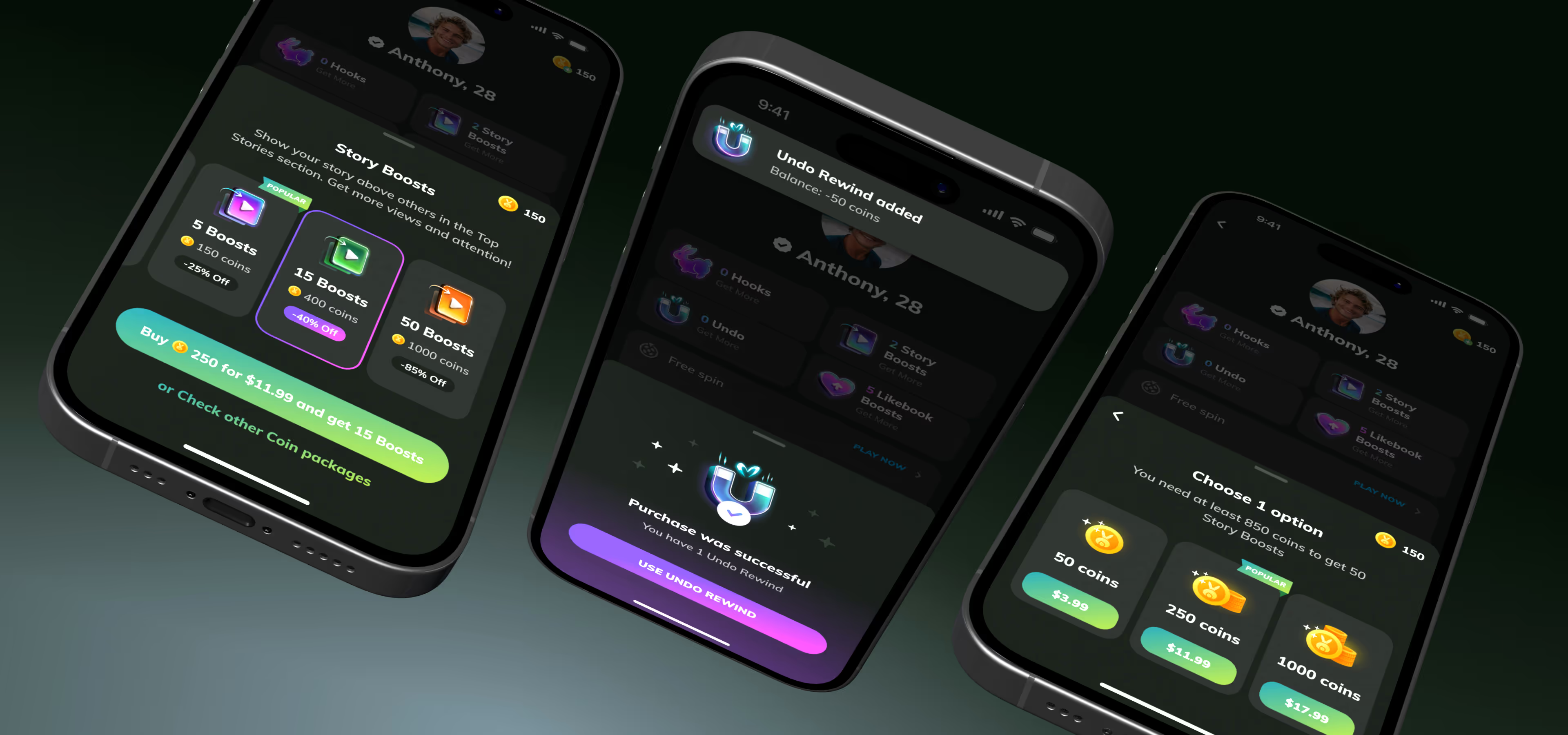
We audited our existing feature purchase flow and saw that when users had enough coins in their balance, the purchase (essentially, exchanging coins for features) is completed successfully. But when users didn’t have enough coins, we were seeing a notable drop-off rate between the Сoin purchase screen and the final step of the flow where user actually exchanges coins for the feature.
This was a problem for us because it meant that the Coin purchase screen was a barrier for users trying to buy features.
To address this, our goal was to optimize the feature purchase flow to reduce friction, make purchasing faster, and, as a result, increase conversion from attempt to payment.
Below is an overview of the previous feature purchase flow.
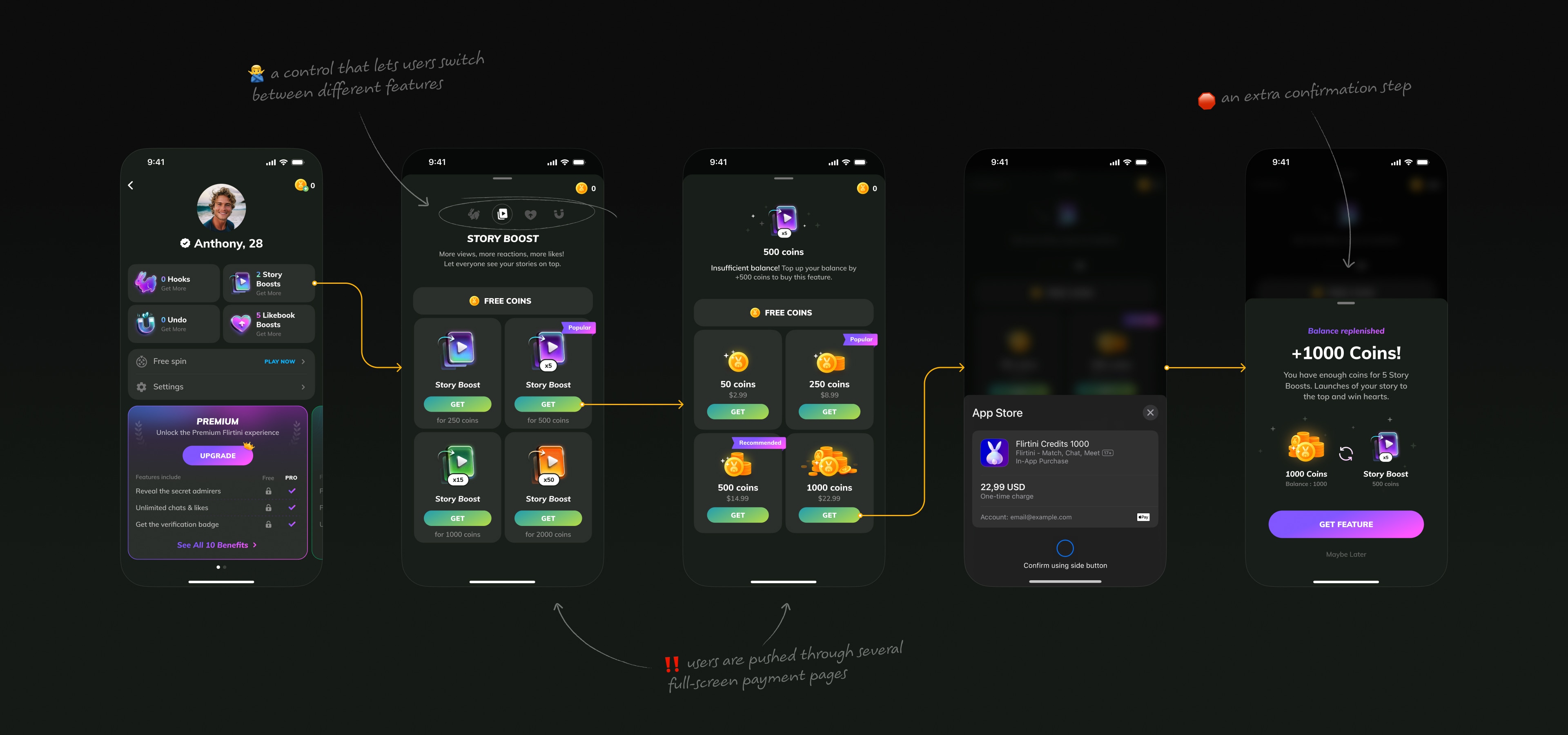
After analysing the existing feature purchase flow, I identified several issues that could negatively affect the purchase experience:
With that in mind, I proposed the following improvements to make the feature purchase flow faster and easier to complete:
For users who want to choose a different coin bundle instead of the minimum required to purchase a feature, we added a way to view all available coin bundles. They appear on the same bottom sheet, along with a hint on how many coins are needed. We also added a clear back button to let users easily return to the previous step.
Below are prototypes showing the full purchasing flow for different features.
As a result we increased rev2reg by 17% by simplifying the purchasing flow.
Being left on read can be a frustrating experience for users on dating platforms. To address this, we released the Hook feature, which functions similarly to a superlike and helps users stand out. If you're particularly interested in someone, you naturally want a response. The Hook feature elevates the user's message to the top of their match's chat list, increasing the likelihood of a reply.
In the beginning, we didn’t have a clear vision for how this feature should work or look. The only clear goal was to make it easy to use, engaging, and fun. With that in mind, I began exploring different ideas.
After a few more iterations, we landed on the following solution.
To keep the animation from feeling repetitive, I added variation by switching the side the rabbit turns to with each Hook send. I also added a small idle animation, with the rabbit shifting from foot to foot, to make the character feel more lively and warm, while subtly encouraging repeated use of the feature.
Once the Hook sending animation was ready, I moved on to the second part of the feature – the ability to send a message along with a Hook.
We settled on a solution that lets users either write a message themselves or send an icebreaker. After redesigning the loader used during icebreaker generation as a separate task, I also updated this part of the flow to reflect the new experience.
After releasing the new feature, it was important to introduce it clearly to users. I designed an introduction sheet that maintains spatial consistency by positioning the Hook button in the same place where it appears on the Likebook screen after closing the sheet. This reduces cognitive load and allows users to easily recognize the button and use the feature right away.
I also designed an additional introduction sheet that communicates the core value of the feature – a sent Hook appears at the top of the recipient’s chat list, ensuring it won’t be missed. This intro is shown after a user’s first tap on the Hook button in their profile.
In addition, I designed new purchase screens for Hooks, where users can buy them either individually or as part of a subscription.
The Hook feature increased the number of initiated conversations and reduced drop-off after a match by giving users a more expressive way to show interest and by prioritizing incoming Hooks in the chat list.
In addition, offering Hooks both as a standalone purchase and as part of a subscription, the feature is expected to increase LTV by lowering the barrier to transaction and supporting more frequent, flexible purchasing behavior.
In dating interfaces, users tend to value proactive ways to draw attention to their messages – not just likes, but also contextual expressions of interest.
Strong visual and emotional design increases the perceived value of an action. Animation and metaphor can make a feature more perceptible and memorable.
Small animation details can make an interface not only clearer, but also emotionally appealing, which naturally leads to increased engagement.